Object Detail
Description
funda is The Netherlands’ biggest real estate website with ~45 milion visits a month. Together with my multidisciplinary team, I was responsible for everyting around the presentation of the houses. Also known as the Object Detail page.
Role
User Experience Designer
Redesigned from the ground up
In 2015, the platform was in need for a mobile-first approach. Back then 35% of the users used a touch device, this number has grown to 70% nowadays.
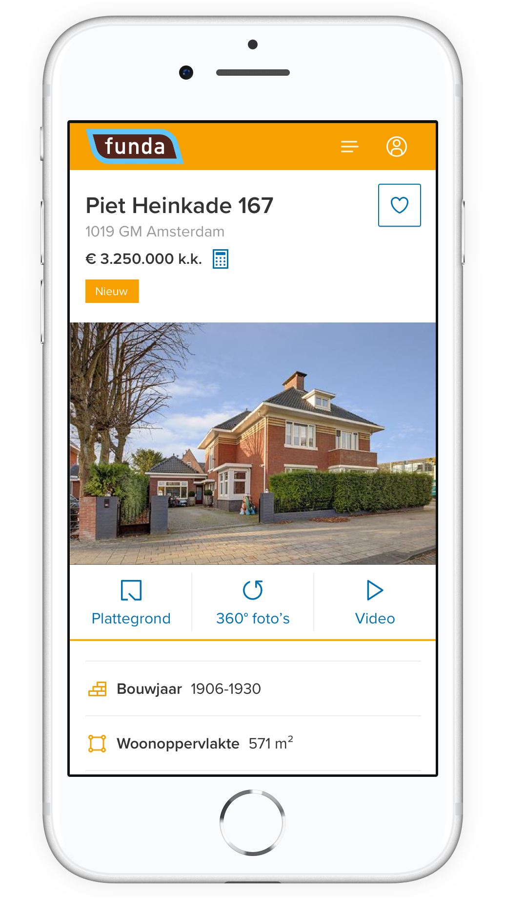
Experience your dreamhouse as if you’re there
Searching for a house is a rather emotional process, people decide if they want to give the house a chance based on the photos. Big imagery has a prominent position because of that.
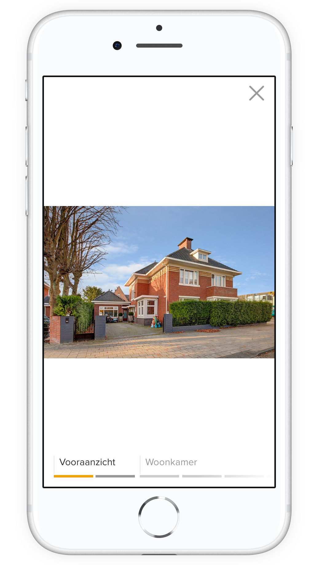
Category navigation helps users to quickly jump to different sections of a house and orient where they are.
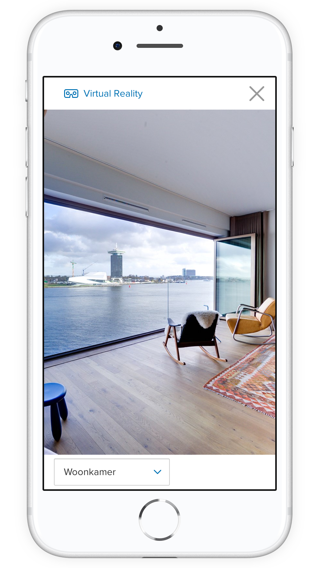
Users can get a better look of the house with 360° photos. Even in Virtual Reality.
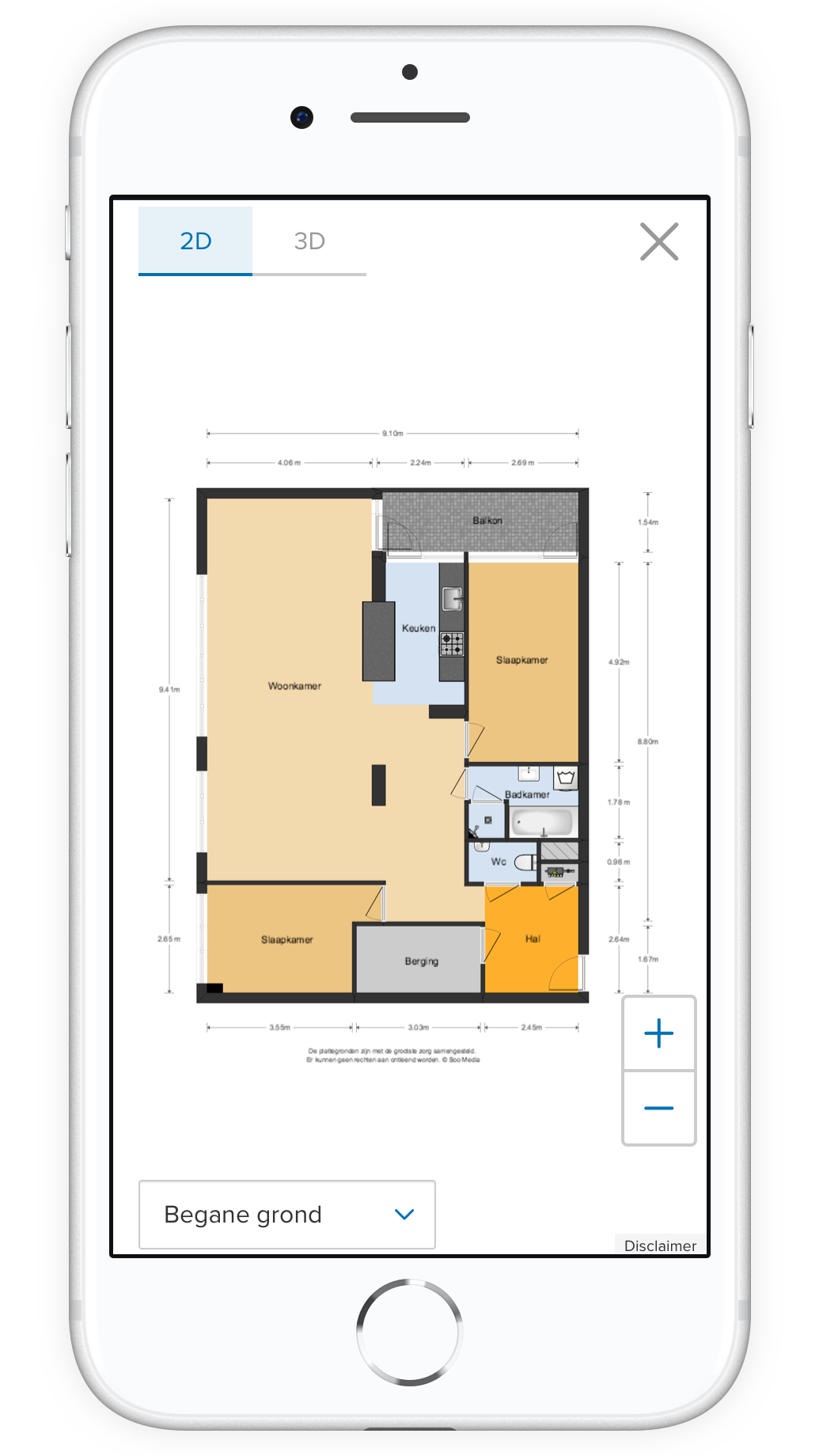
With the clean and interactive floorplans users can start dreaming of their possibilities with furniture.
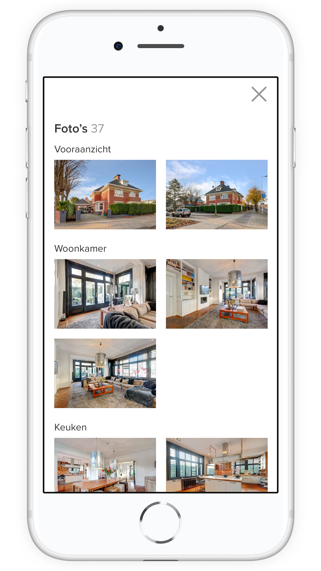
Got lost? With overview users can quickly scan and jump to the right photo, floorplan or others.
Explore the neighborhood with facilities
funda recently launched locations to help users explore their new neighborhood. With the tool, users are able to answer questions like ‘where are the schools for my kids?’ and ‘how do you get to work?’.
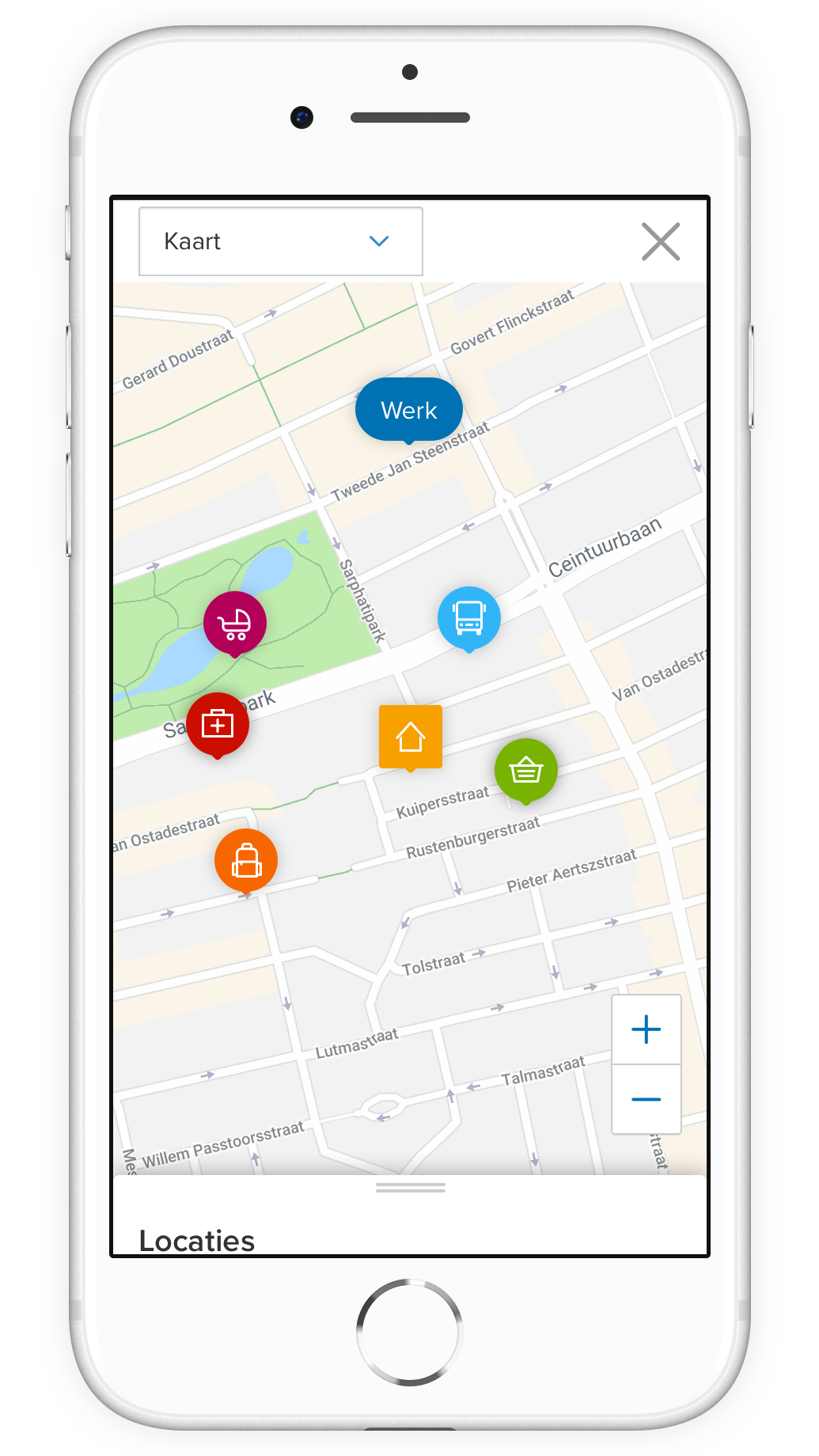
Explore nearby schools, daycare, supermarkets, public transport and healtcare near your house.
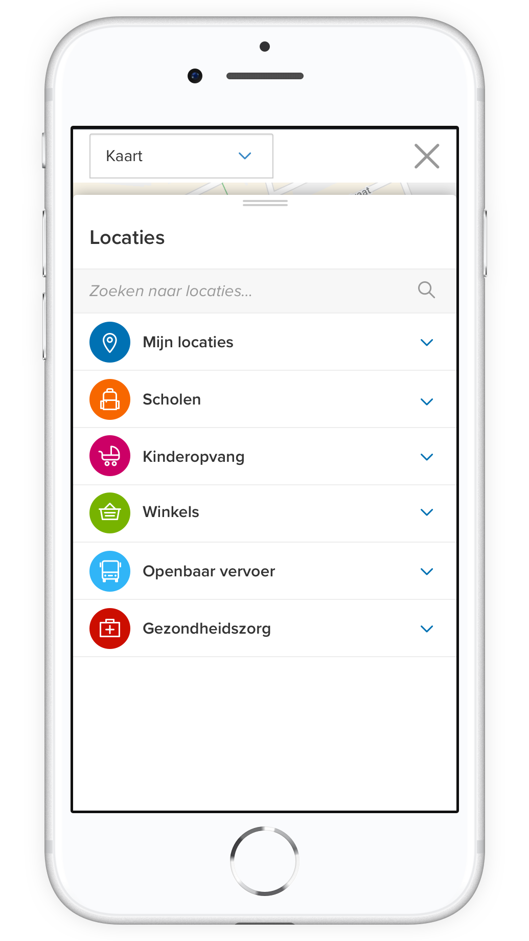
With locations spanning five categories you can find what location is most important to you.
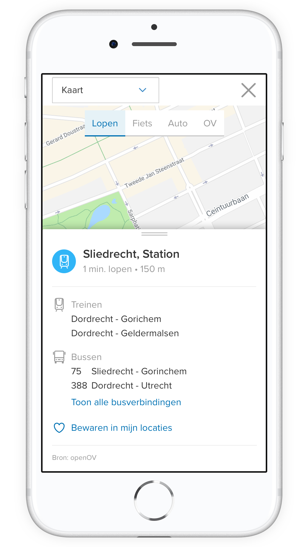
Each location gives users a small glimpse of information - including a link where to find more.
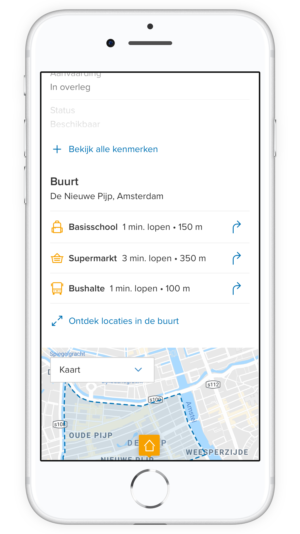
Your most important locations can be found in a compact overview with each house.
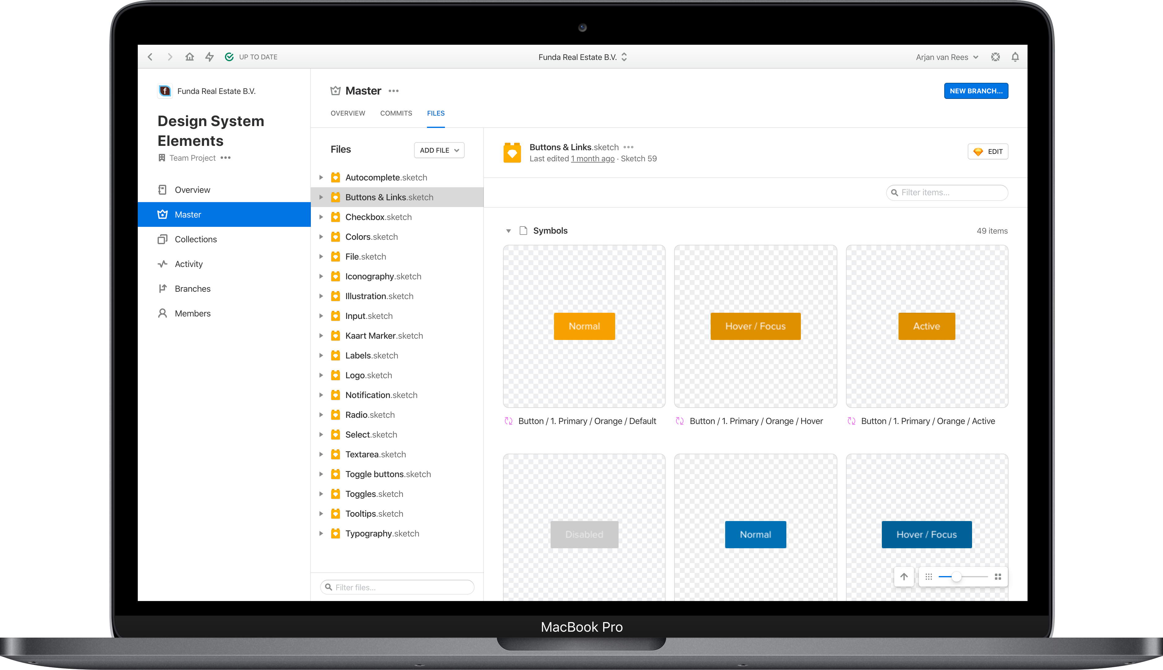
A Design System for collaboration
In a team with multiple designers, sharing components and ensuring consistency are common challenges. I took the initative to set up a Design System. It is available in Sketch via Abstract (and now in Figma), thus directly available in the designer’s workflow.
