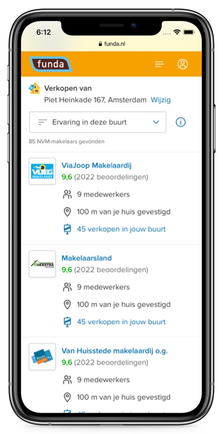
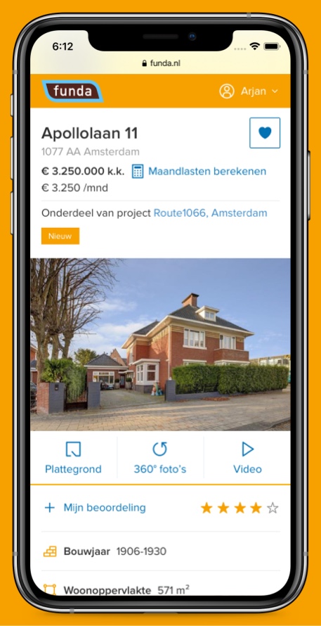
Office Page
Description
funda is probably best known as a marketplace for houses, but funda also helps to find the best real estate agent near you. With new features as the Office Page and Makelaar Search funda tries to bring user and agent together.
Role
User Experience Designer
The two sides of a story
The Office Page page is designed for users to quickly get to know the agent. And for agents to give the best first impression of themselves. We spoke to users and agents to get to know that they find important, and balanced the priorities in the design.

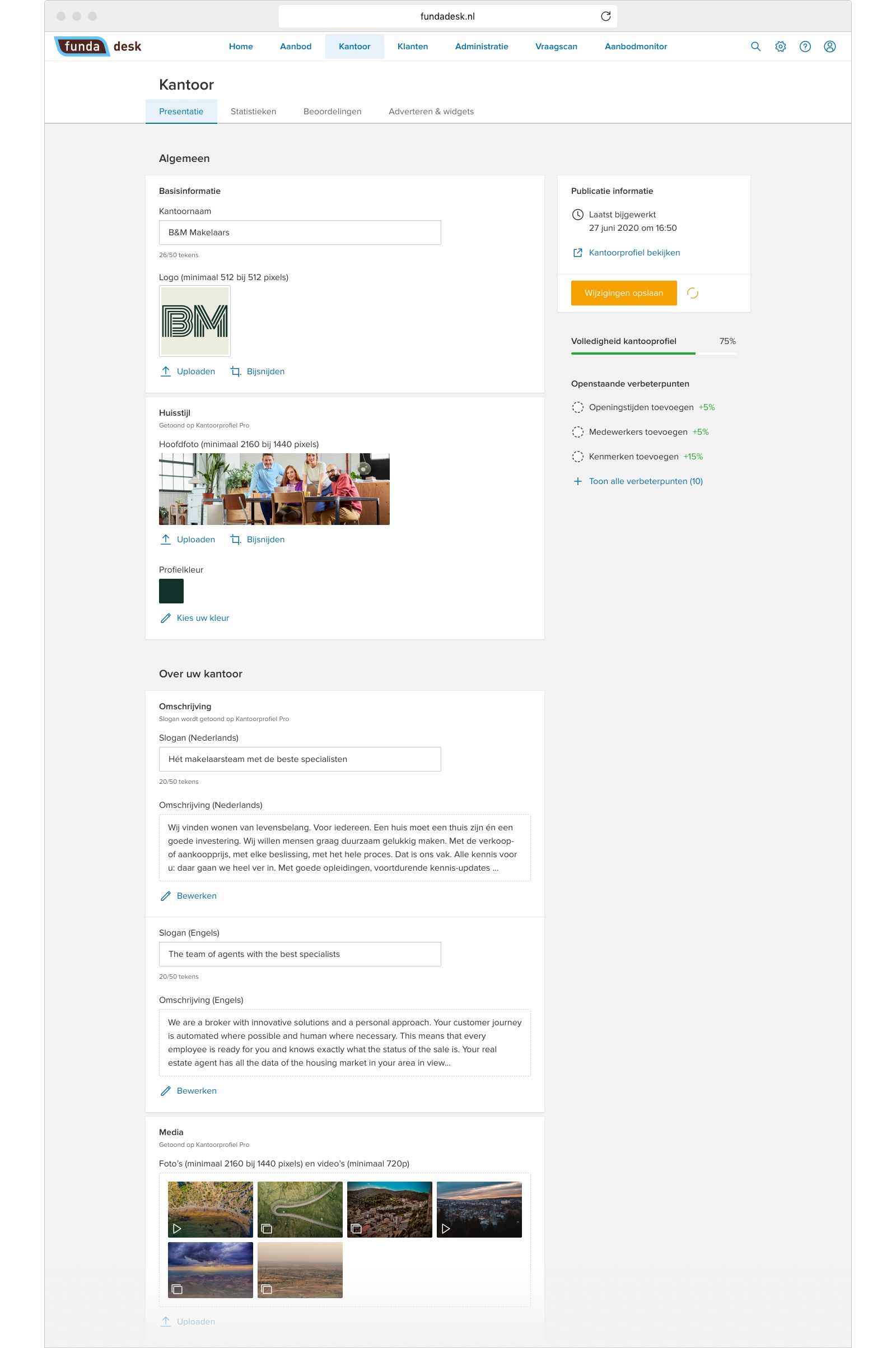
Mission Control in funda desk
In funda desk, agents are in control over every detail of their Office Page. With feedback from two extensive beta rounds we made sure the transition to the new Office Page will be a smooth experience.
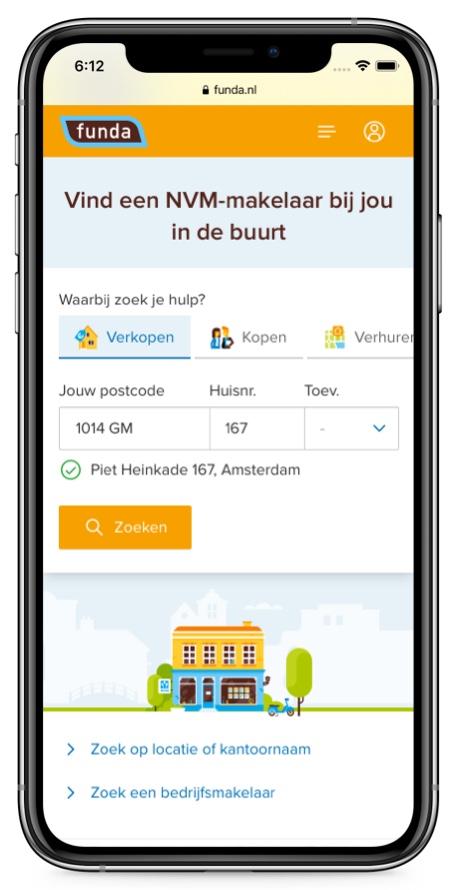
Personalized search engine
Because each users' situation requires a different approach, we opted to simplify this by asking about the users intention. Under the hood, we do the filtering and rank agents that have a measurable track record in the neighborhood.
Compact at first, detailed at second
Based on user research, we were able to select the most important characteristics for the first comparison. More detail needed? The user can see all of the agent's past transactions on the map.
